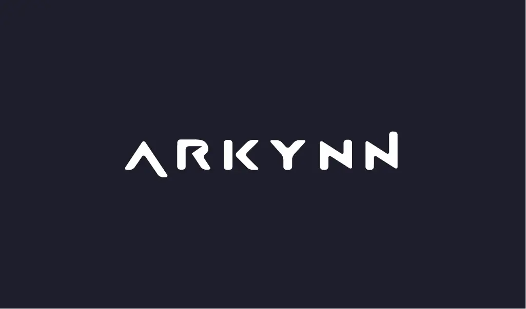
With the years, Arkynn has expanded and developed dramatically, establishing ourselves as a top boutique company. We felt that going forward, it was essential to align our visual identity with the core principles and objectives of the company. To do this, we partnered with JustMonkeys, a well-known creative studio and consultancy firm with headquarters in Hong Kong and renowned for its excellent brand development work.
Crafting a Brand Identity That Lives by Arkynn’s Values
Arkynn’s approach is built on our commitment to provide a highly specialized boutique experience backed by top-notch expertise. Our goal was to create a brand identity that exudes approachability, friendliness, and trust—qualities that are crucial to our interactions with our clients. Working with JustMonkeys, we developed a visual language that successfully communicates these values and ensures that our target market can relate to our brand identity.
Redesigned Logo: Simplicity, Reliability and Flexibility
Our ongoing commitment to quality, simplicity, and a human touch is shown by the new Arkynn logo. While referencing the classic elegance of old font, the design also includes modern elements that reflect our progressive approach. The elongated A and N represent our natural propensity to go above and beyond in order to succeed while using flexibility as a tool. Fundamentally, this is simplicity. The little scuff in the R represents leaving your mark on the world, which we believe is the fruit of our labor.
Color Scheme: Warmth, Approachability, Professionalism
Our most recent color scheme is just as important in projecting a welcoming and trustworthy image as the logo. Strong foundations and professional and stable communication are conveyed by the main dark color (#1D1E2C) and the gray color (#59656F). Warmth and approachability are added with the secondary dark color (#9C528B), which softens the overall look and enhances readability. The logo is boldly white (#FFFFFF) for best impact and visibility on dark backgrounds. Many different environments and situations suit this carefully selected color scheme.
Typography: Adding Elegance to Readability
Arkynn’s new brand identity’s typography choice strikes the perfect balance between beauty and intelligibility. Our selections of fonts show our attention to detail and experience and are readable on a range of platforms and devices. Typeface is crucial to maintain a consistent brand image and effectively communicate our message.
Making Over a Website to Show Expertise and Enhance User Experience
In keeping with our new corporate image, we have updated our website to enhance user experience and more successfully promote our experience. Developing a visually appealing platform that effectively communicates our services and beliefs, improving navigation and content organization, and incorporating the redesigned brand identity were the primary objectives of the makeover. A cohesive and engrossing user experience is produced by the deft integration of the updated typography, color scheme, and visual elements. Plenty of material has still to be published and features added, so this is still a work in progress (hint: a new client portal is in the works as well).
The Importance of the New Brand Image of Arkynn
The new corporate brand for Arkynn has received overwhelmingly positive feedback from industry peers and customers. Our commitment to offer customized, excellent services is highlighted by the revised brand style, which also helps to solidify our standing as a trustworthy partner. We want to keep introducing the new brand identity into every touchpoint as we go forward to provide our clients a consistent and unforgettable experience.
Arkynn could not have effectively launched its new corporate identity without the vital collaboration with the creative agency JustMonkeys. Their talent and creative vision have enabled our brand story, and we are really grateful for our partnership.
We are led as we start this new chapter by the ideas of individual competence and trust, with an eye toward continued success and expansion. Our new brand identity, which establishes a strong base for the future, enables us to better interact with our clients and keep our leadership position in the executive search and consulting industry.


